Zelle is a P2P payment service that lets consumers send and receive money directly from their mobile banking apps. While working with Zelle in various roles (graphic designer, art director, associate creative director), I was responsible for producing on-brand assets while continuously refining and expanding the brand guidelines. Below are the key visual branding elements I focused on, as well as some asset samples produced between 2017-2023.
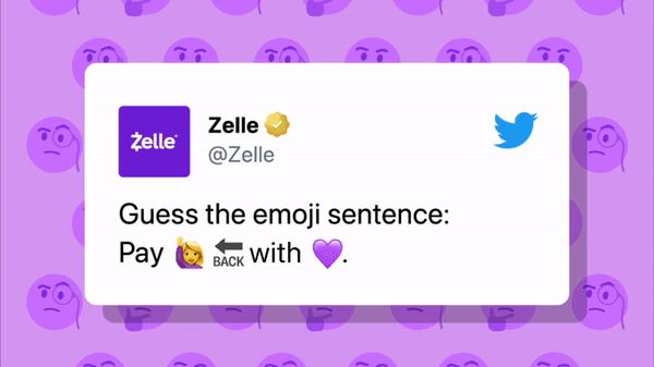
Iconography
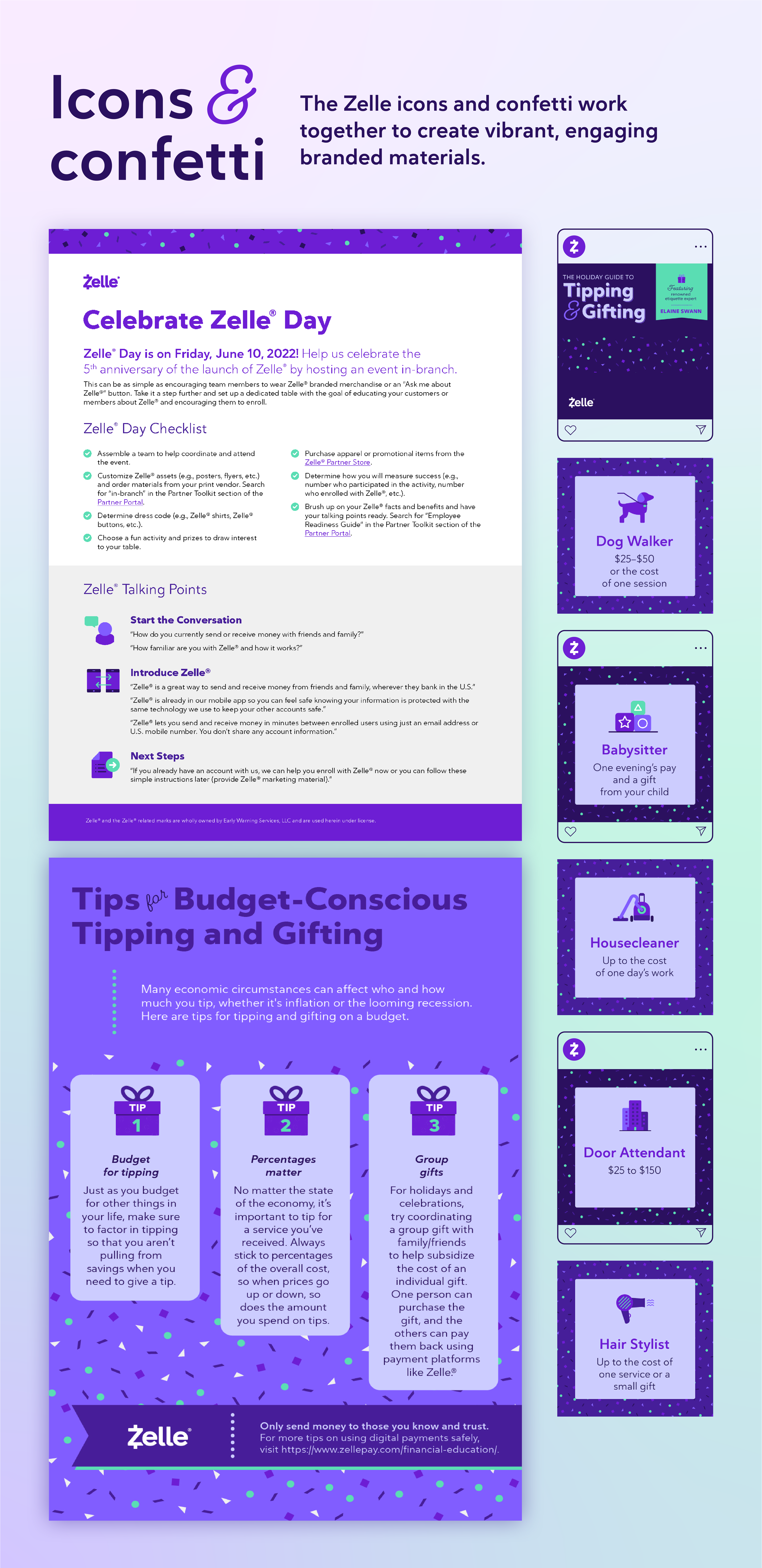
Zelle needed a library of icons that could be used to quickly produce visually engaging, on-brand assets. As Graphic Designer, I created a library of over 100 line icons. Then, as Art Director, I developed a solid filled icon style to add more color and interest. These solid filled icons also served as a starting point for more detailed illustrations. Finally, as Associate Creative Director, I worked with my team to refine and expand the library to over 200 icons.
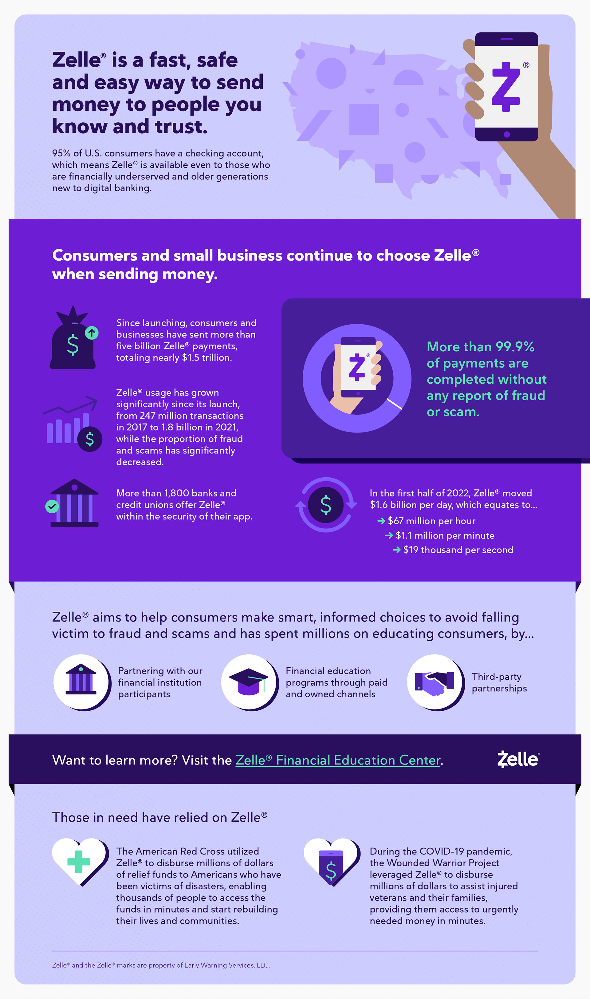
The below infographic demonstrates how the icons were used to significantly reduce turnaround times for design assets. When our team was short-staffed, I was able to deliver this infographic with less than a day's notice because I pulled all of the icons from our existing library.
Shapes
The Zelle shapes, derived from the logo, can be used in various ways across branded assets.
One of my favorite use cases was this stage treatment at Pitchfork Music Festival, where Zelle was a sponsor. When we needed a branded (but not hit-you-over-the-head-with-it) aesthetic for this backdrop and podium, I knew right away it was the perfect place to showcase the shapes.

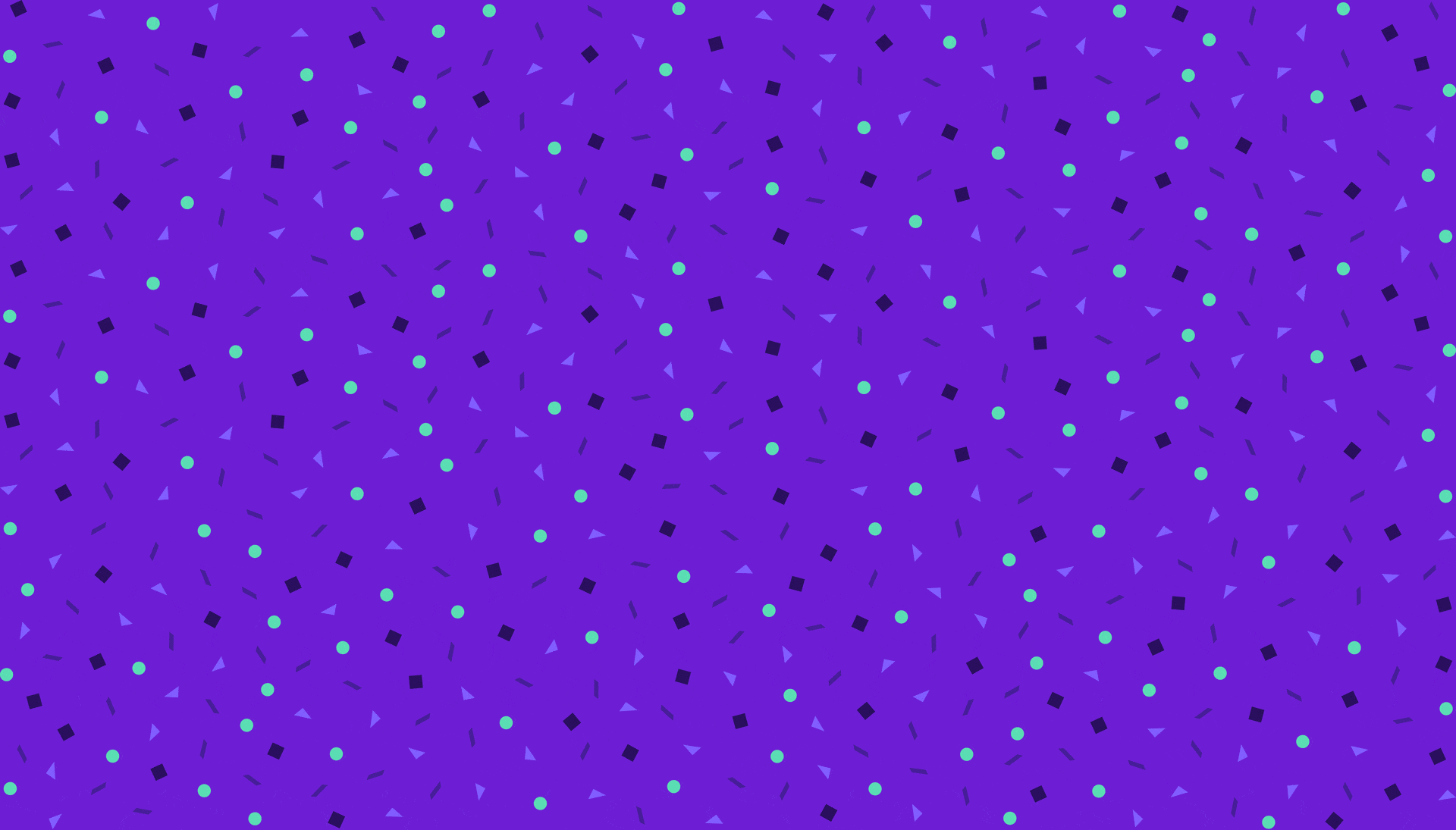
Another application of the shapes was in the form of confetti. In the early stages of the brand, the confetti was difficult to scale across different assets because there were no guidelines for it. Each time we wanted to use the confetti, the designer would have to individually color and place each tiny shape within the design, which took ages—and resulted in an inconsistent look across assets.
As a solution, I created a master file with large swatches of confetti on brand background colors. The outcome? The confetti was used more easily and consistently to add visual interest and reinforce the brand.
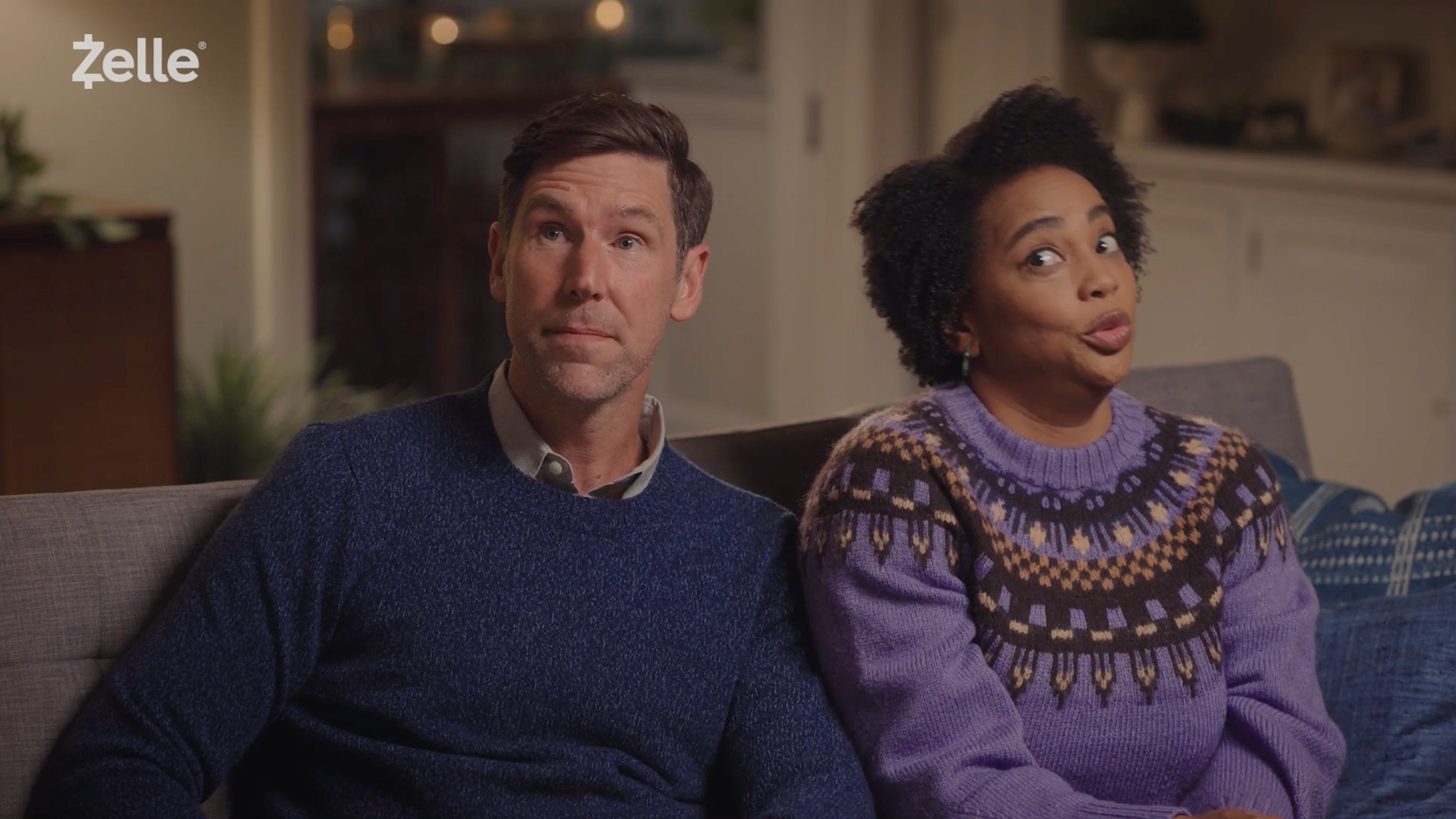
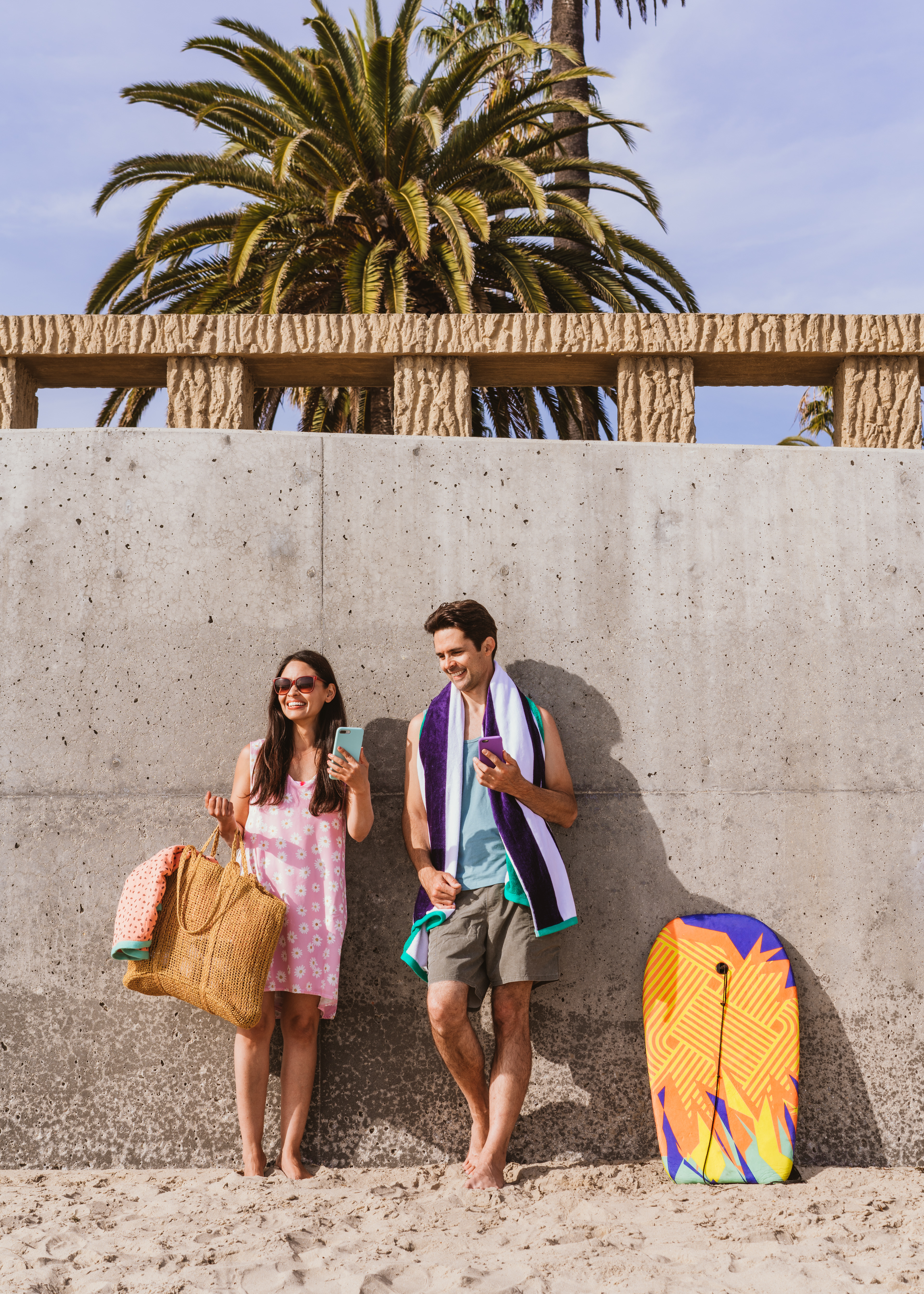
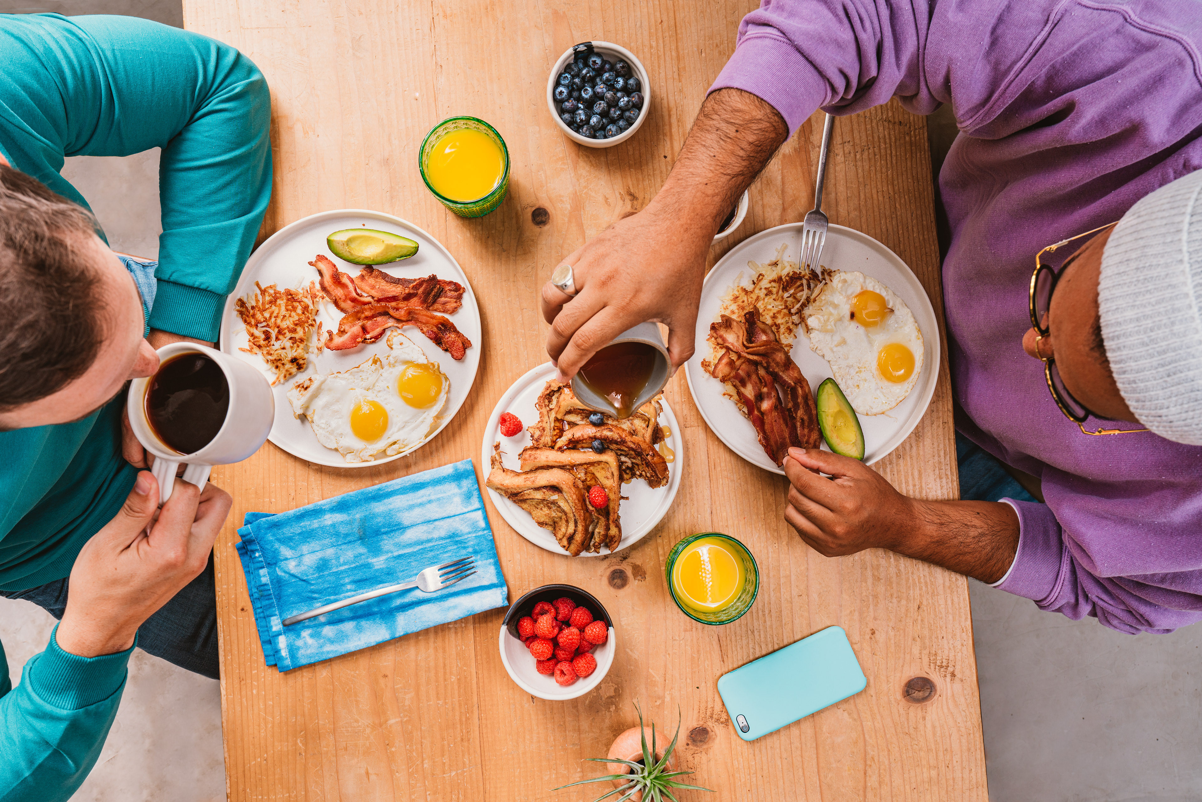
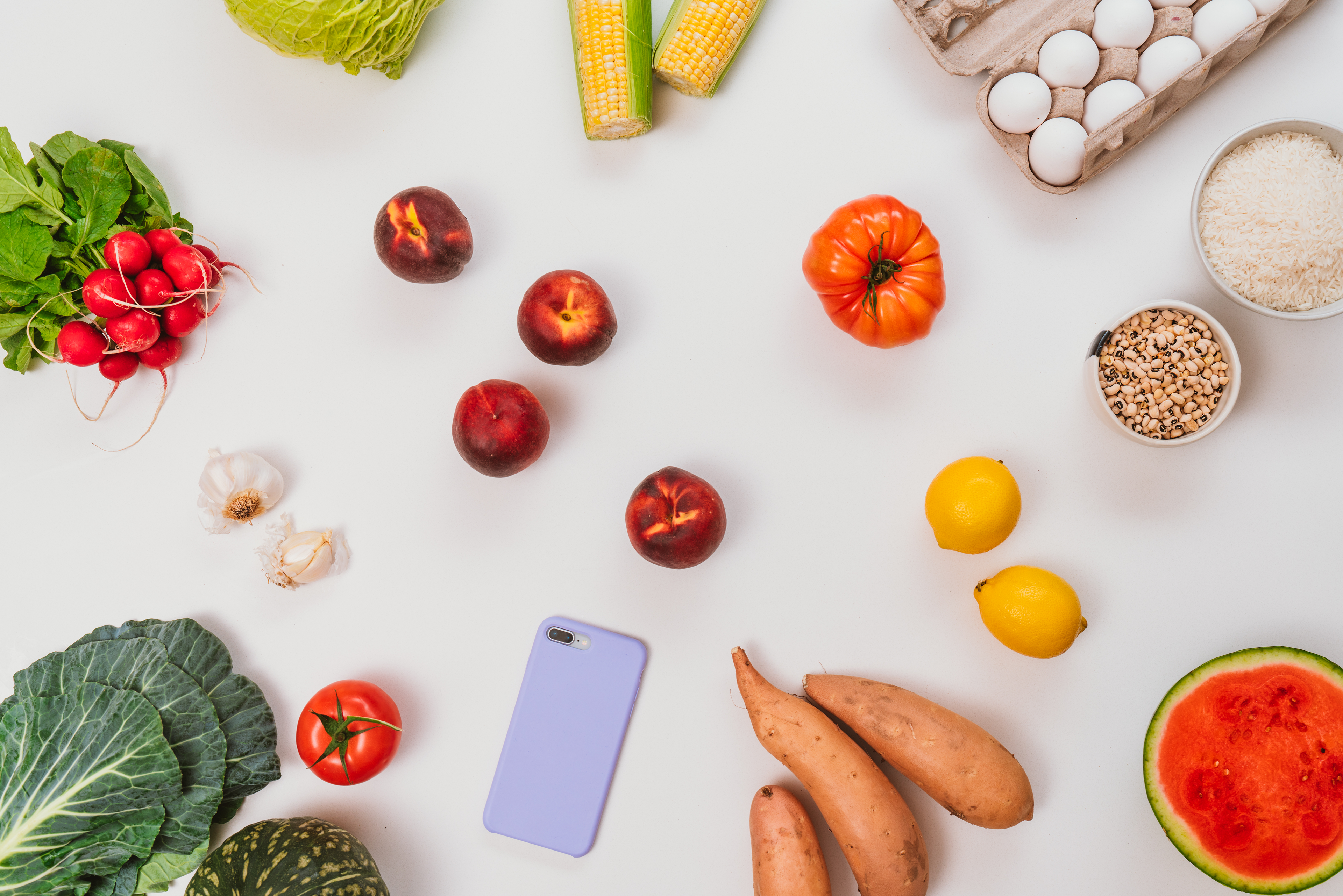
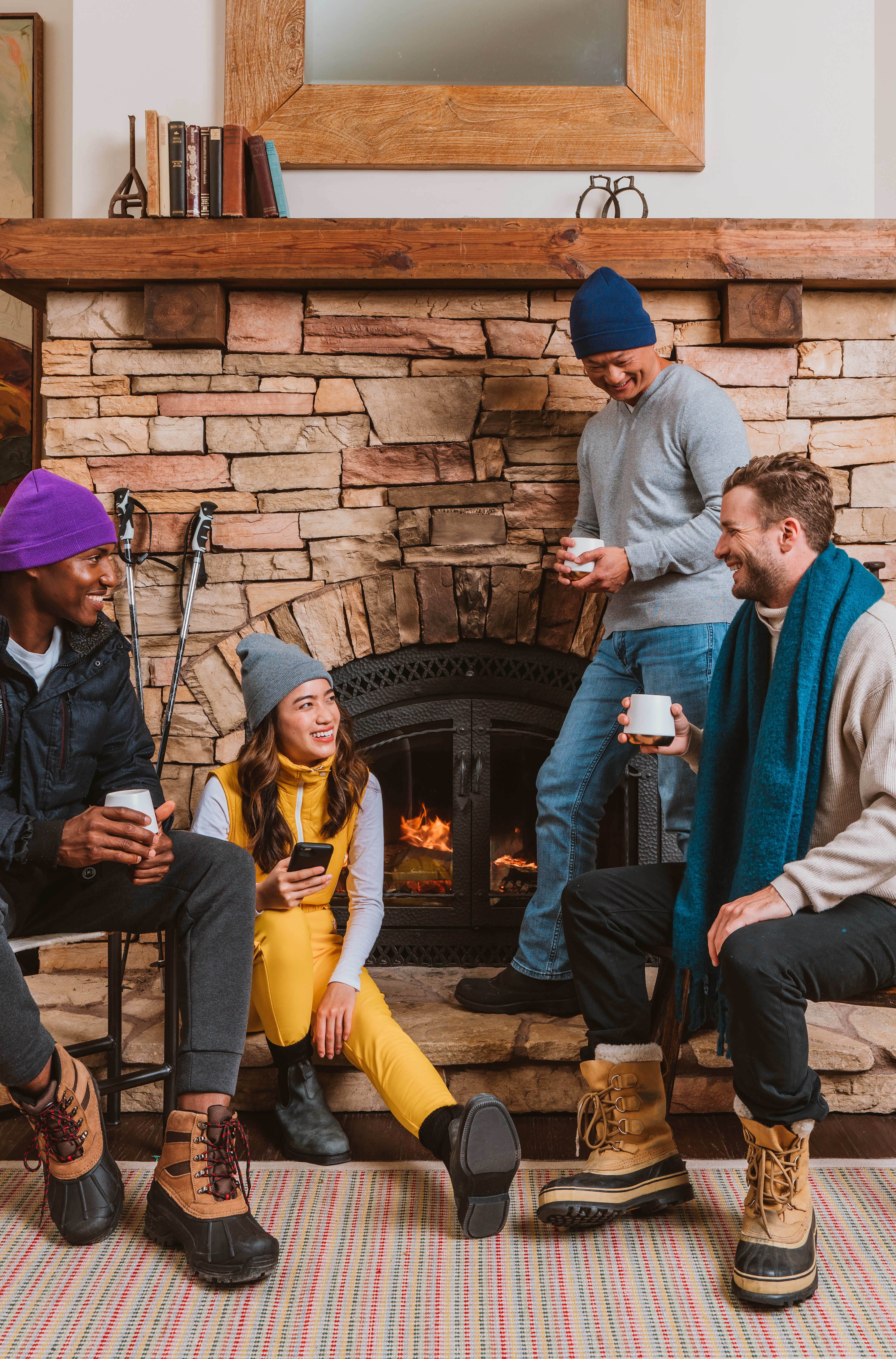
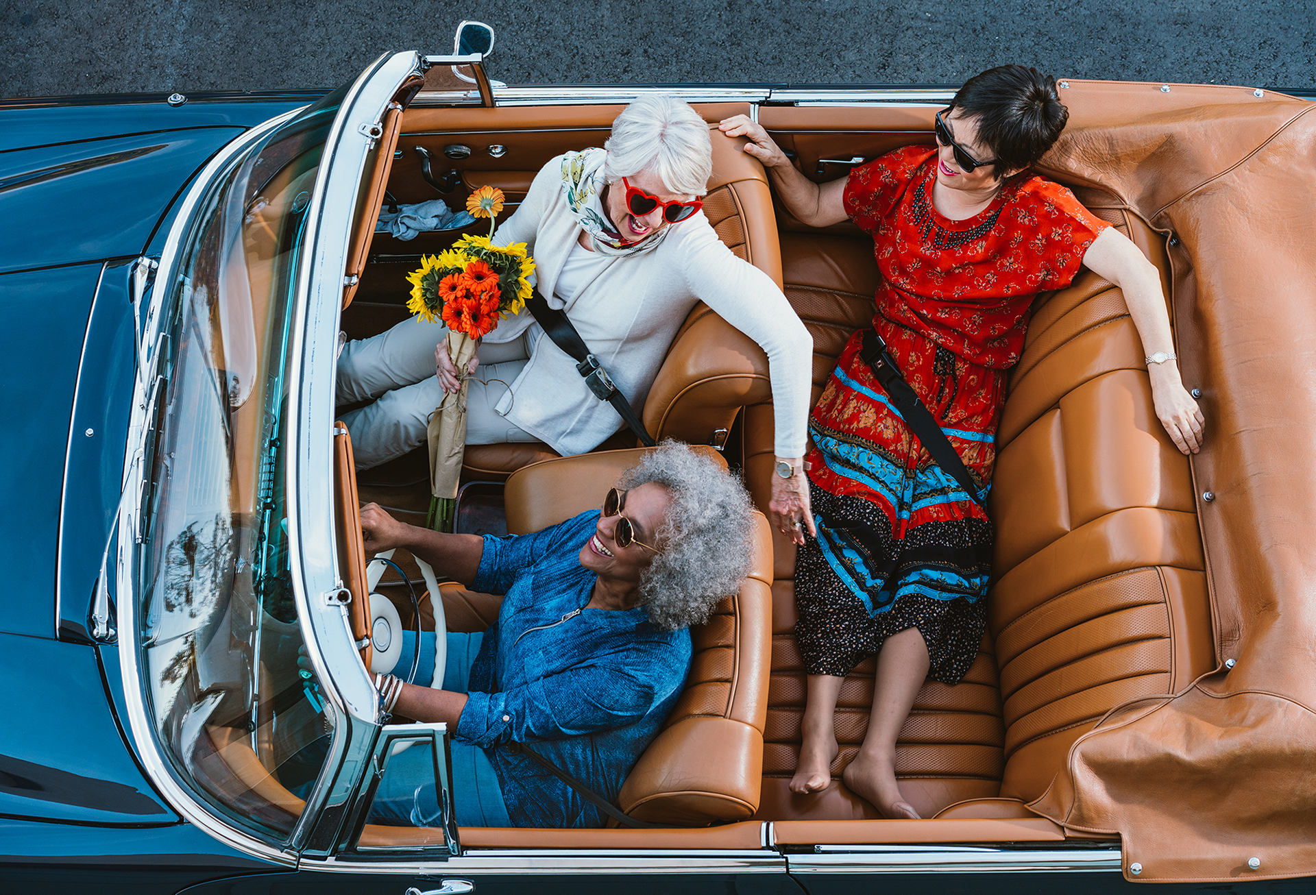
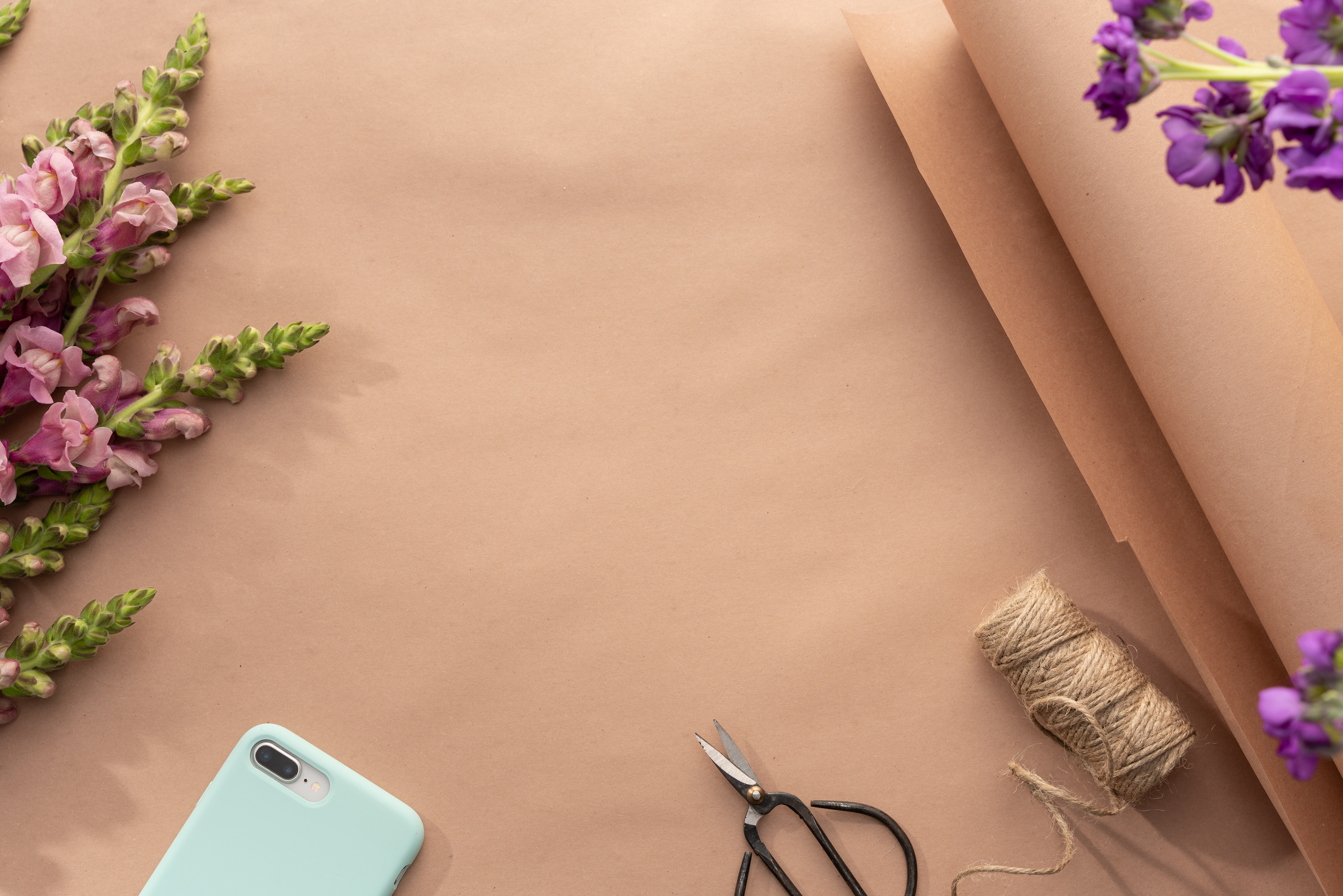
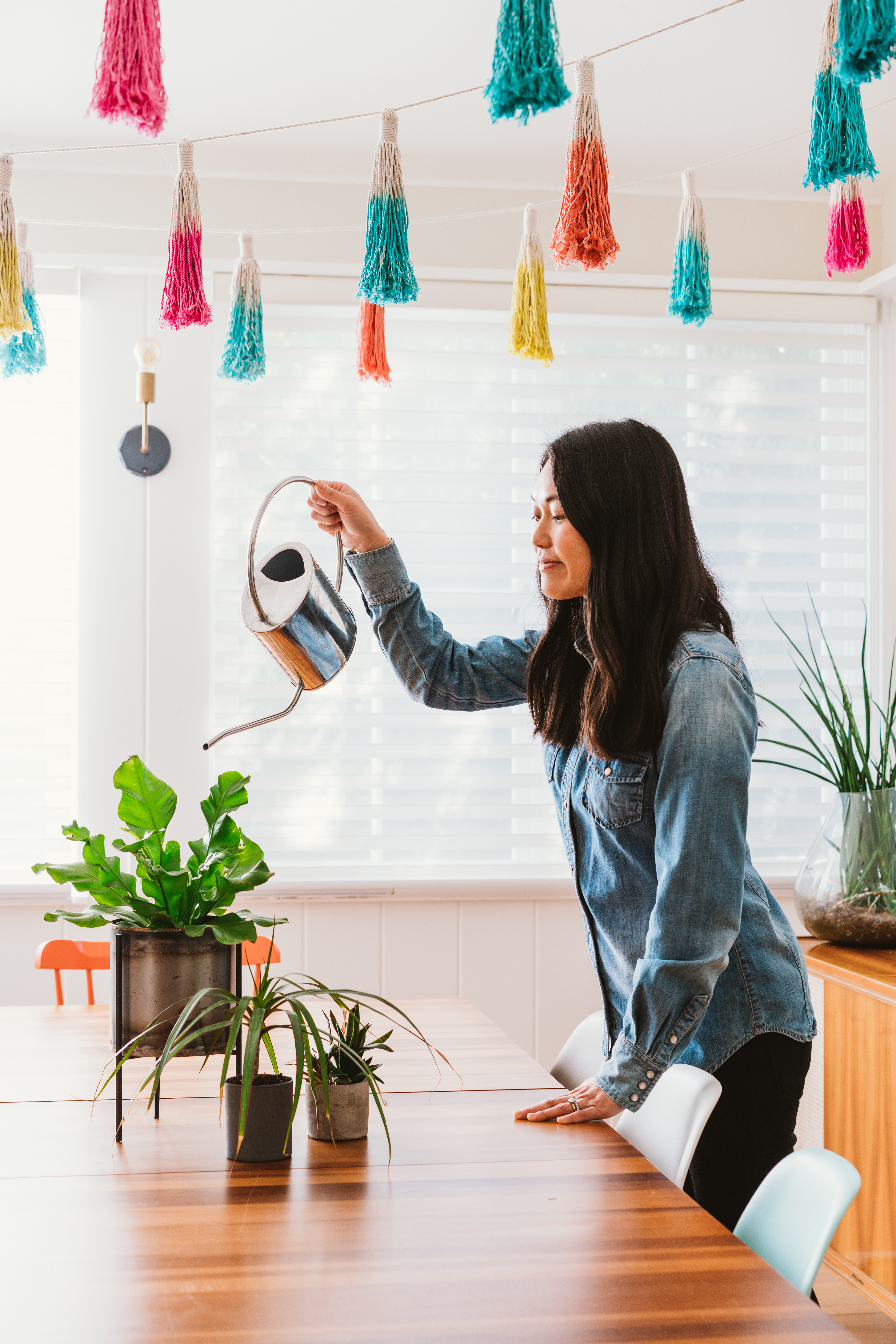
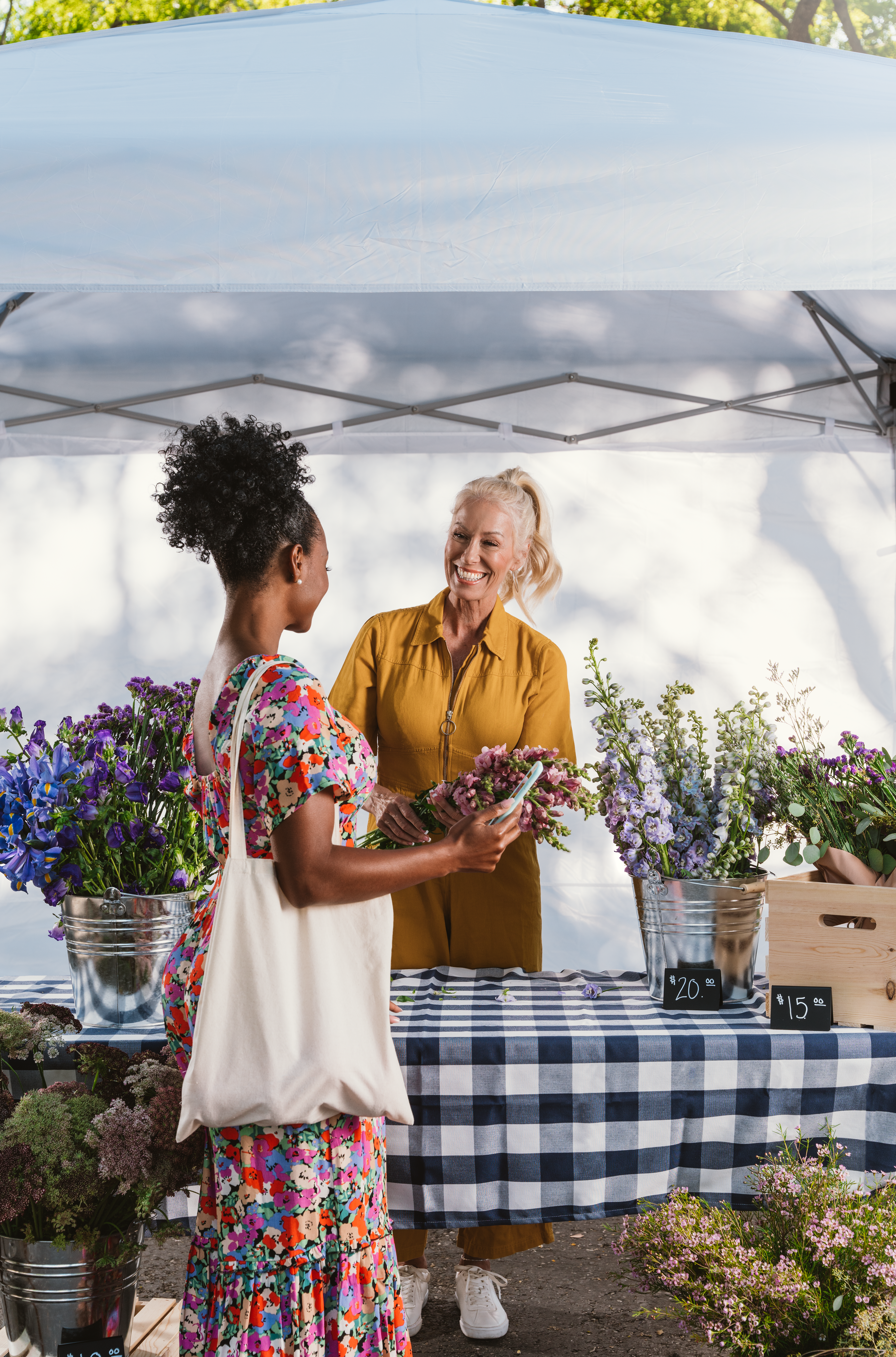
Photography
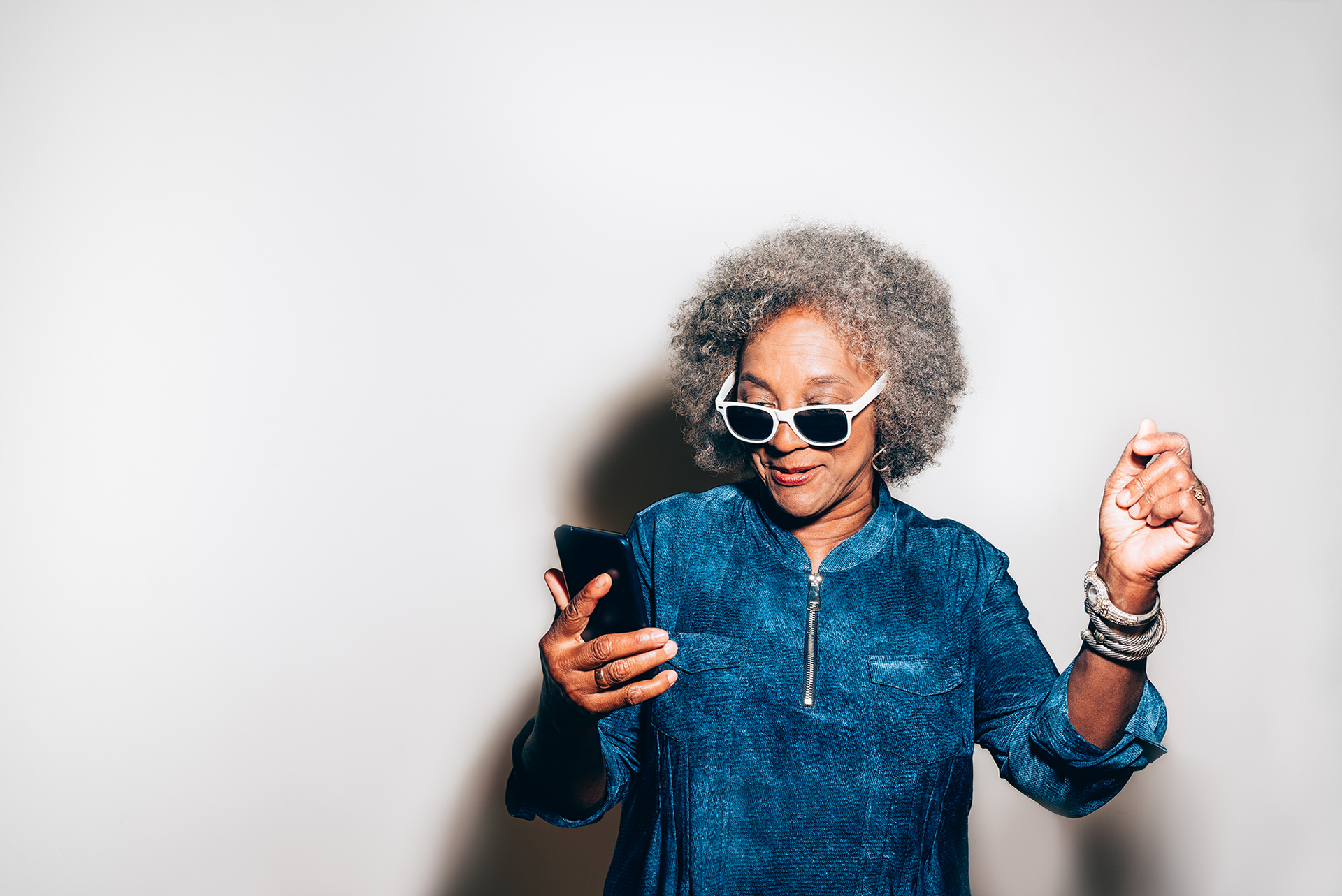
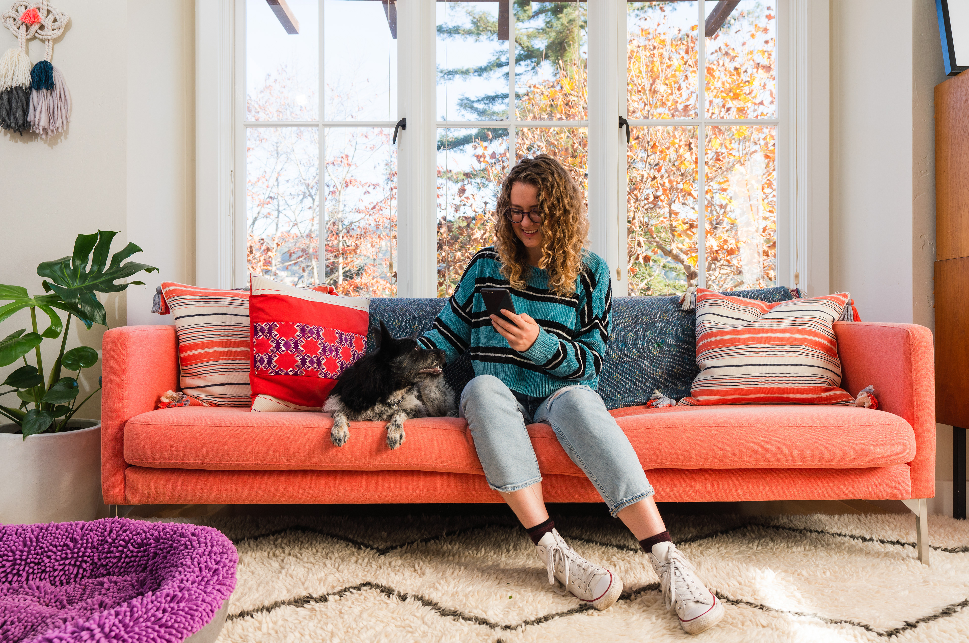
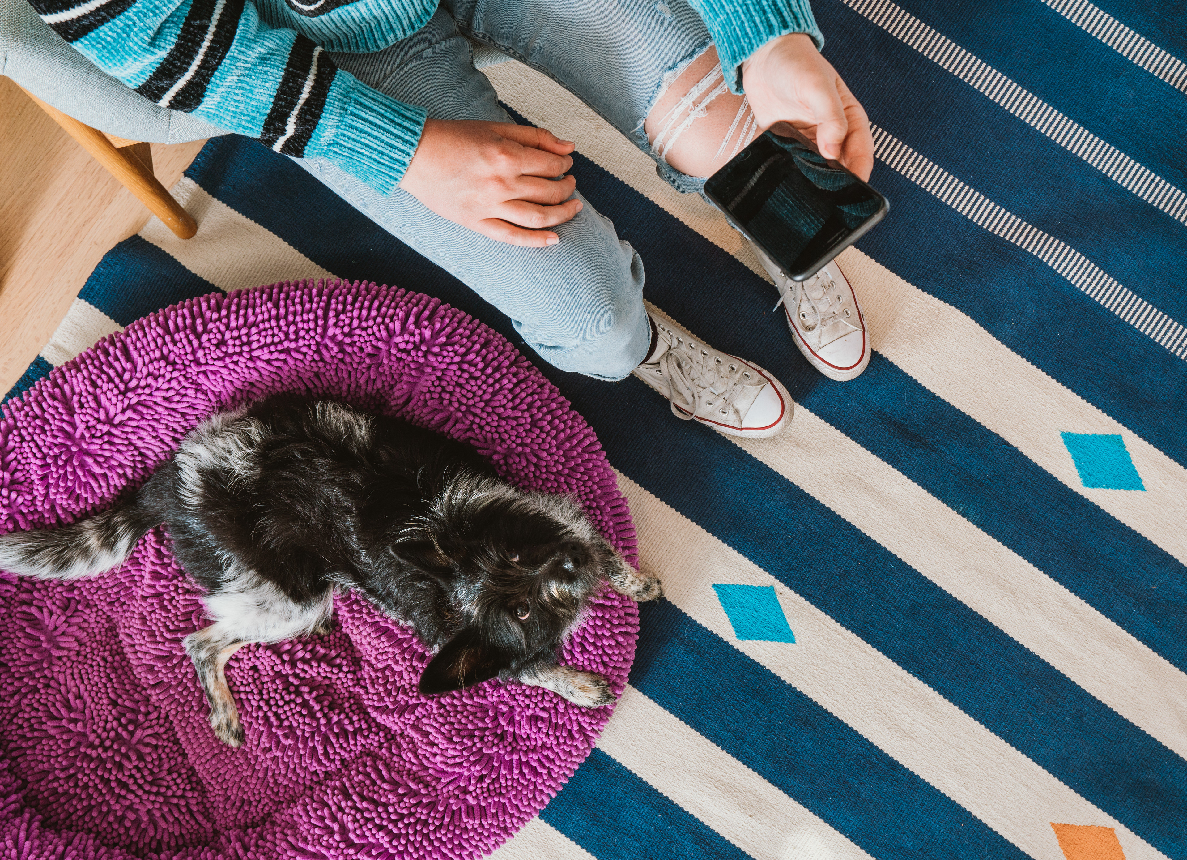
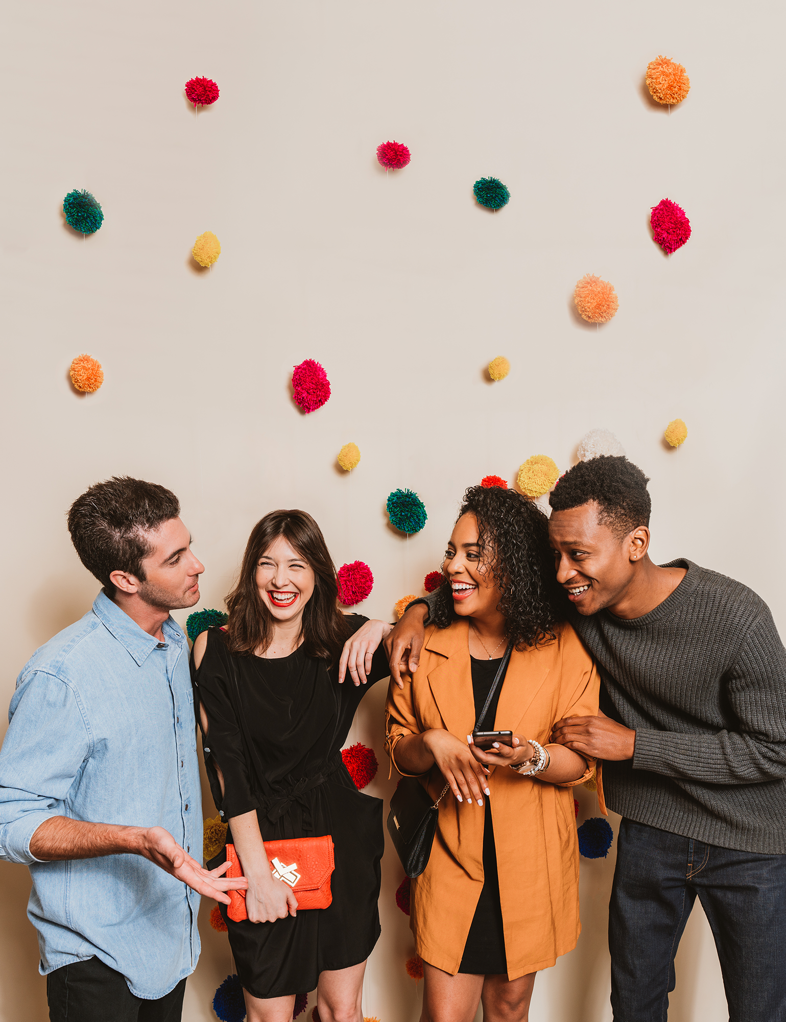
When I joined the company in 2017, the brand photography guidelines soon became my responsibility to own and develop. As I art directed various Zelle shoots, I refined the guidelines to be more distinctive and actionable for photographers (as well as designers sourcing and editing stock photos). One of my favorite projects was creating wardrobe guidelines for the brand, which helped our photography library appear more cohesive and unique. Some examples are below, and you can find more here!


Motion Graphics
Part of my role with Zelle was to oversee projects created in collaboration with agencies, making sure the brand was consistently represented to reinforce brand equity across all touch-points. Motion graphics videos were especially challenging, as there was no previously established illustration or animation style.
I partnered with an agency called Epipheo to develop a consistent, scaleable aesthetic for animated videos across various campaigns—from product explainer videos to educational content. Below is an example from a series of consumer-facing videos outlining various payment scams and how to avoid them.
Motion graphics also played a key role with our B2B audiences. The video below was targeted at financial institutions, explaining the benefits of offering Zelle to consumers through their mobile banking apps.
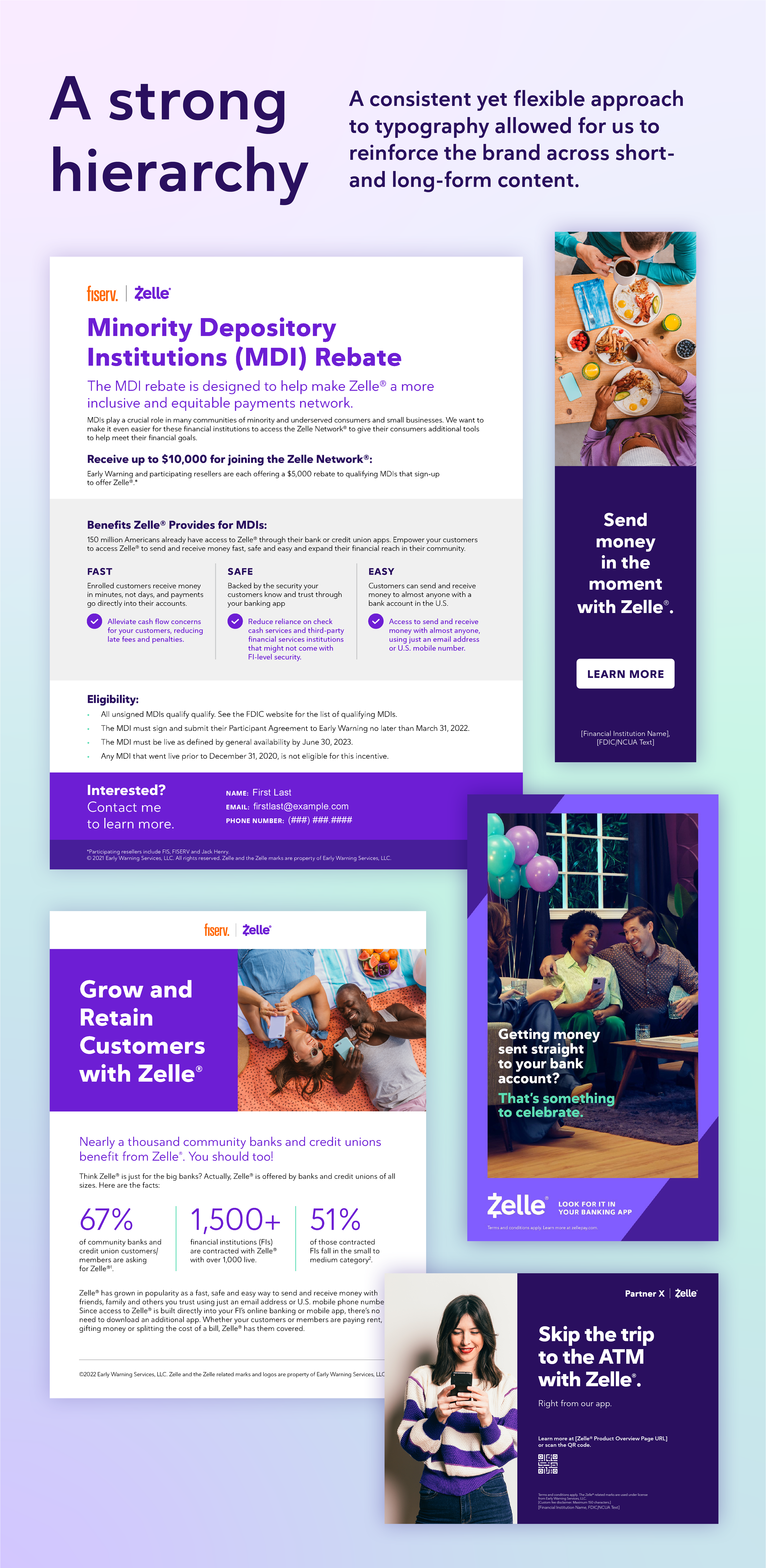
Typography
I worked with my design team to ensure a consistent, versatile type hierarchy across a vast range of materials—from white papers to display ads to out-of-home.
Color
If you know anything about the Zelle brand, you know it's purple. But there's a lot more nuance that goes into applying color to Zelle-branded materials. Starting with the original brand palette, I led the continued development of guidelines around color, accommodating various types of content as the brand grew to new heights.
The original brand palette featured purple and white as primary colors, with indigo and light purple secondary colors, and a green accent. I added grays and two additional purple accents, which made the palette more versatile—especially for iconography and illustrations.
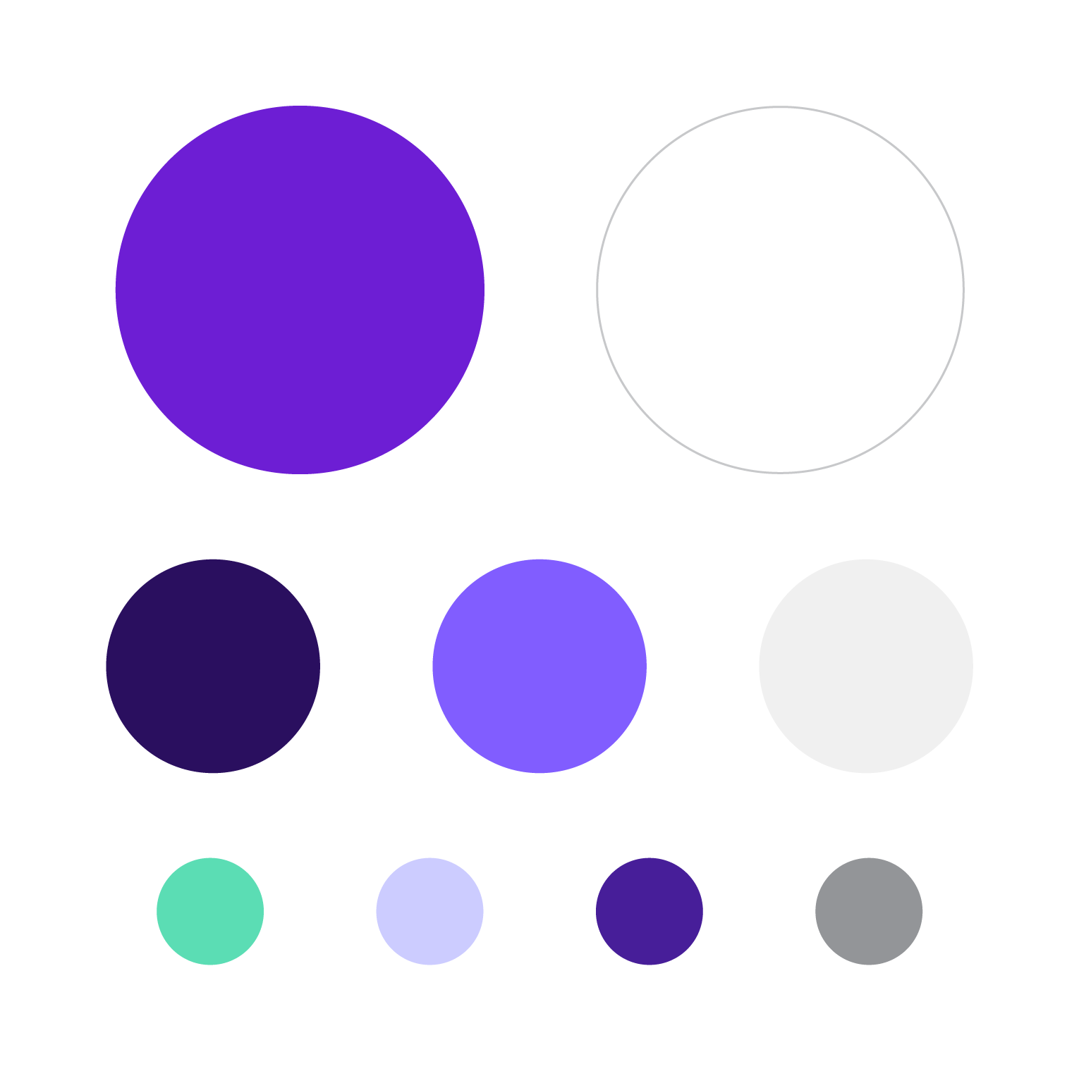
I developed the natural skin tone palette because, well, illustrated purple and green people start to look like ghouls. These colors bring warmth and help to humanize the Zelle brand.

To help mix things up and keep audiences engaged on social media, we needed more colors to work with. I worked with an agency to develop the extended palette for social media. To see how it all came to life, check out this page!

Zelle produces a large volume of educational content, especially regarding how to use Zelle safely and avoid scams. I created this extended palette for educational content to call out potential safety concerns (red) and tips on how to use Zelle safely (yellow).

My role: Art Director; Creative Director; Design Lead; Prop & Wardrobe Stylist
Agency partners: Huge; Epipheo; Pereira O'Dell | Other contributors: Blake Bronstad; Julie Grantz; Ryan Gallagher