Early Warning uses bank-contributed data to help over 2,500 institutions open new accounts, prevent fraud, and make payments. They're most commonly known as the network operator of Zelle. The name Early Warning is a reference to alerting customers of fraud, but after growing and innovating new products over three decades, the company offers so much more than that.
The Challenge
I led a brand refresh to modernize Early Warning's aesthetic and better represent the current state of the company, while maintaining the brand equity gained from 30+ years in the financial space. The new look and feel was designed to convey 1) the peace of mind that results from keeping customers' money safe, and 2) a company that is continuously growing and innovating.
The Outcome
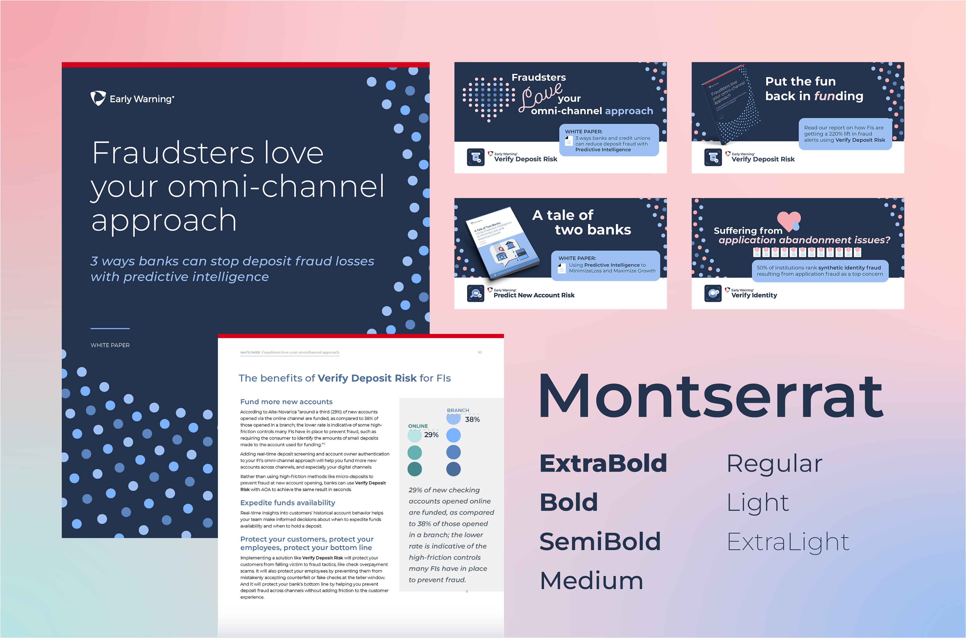
The desired aesthetic was achieved using a calming color palette, smooth curves, and sleek, approachable typography. Icons and image libraries were created to aid in the rapid production of assets, keeping up with the company's accelerated growth. The result? A versatile yet cohesive collection of branded materials conveying growth and peace of mind.
A Closer Look
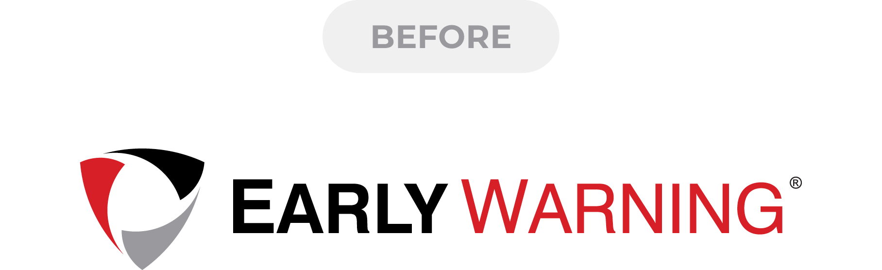
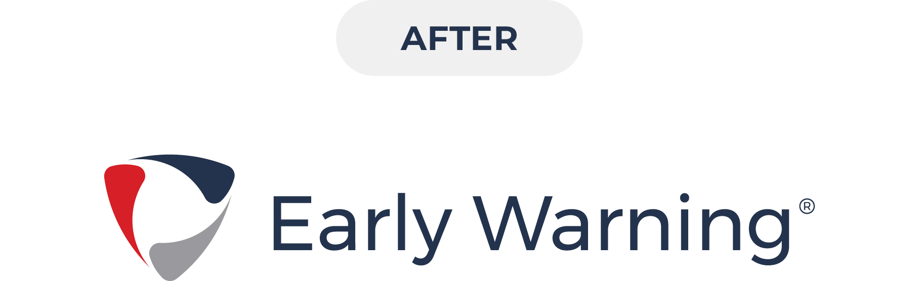
Logo
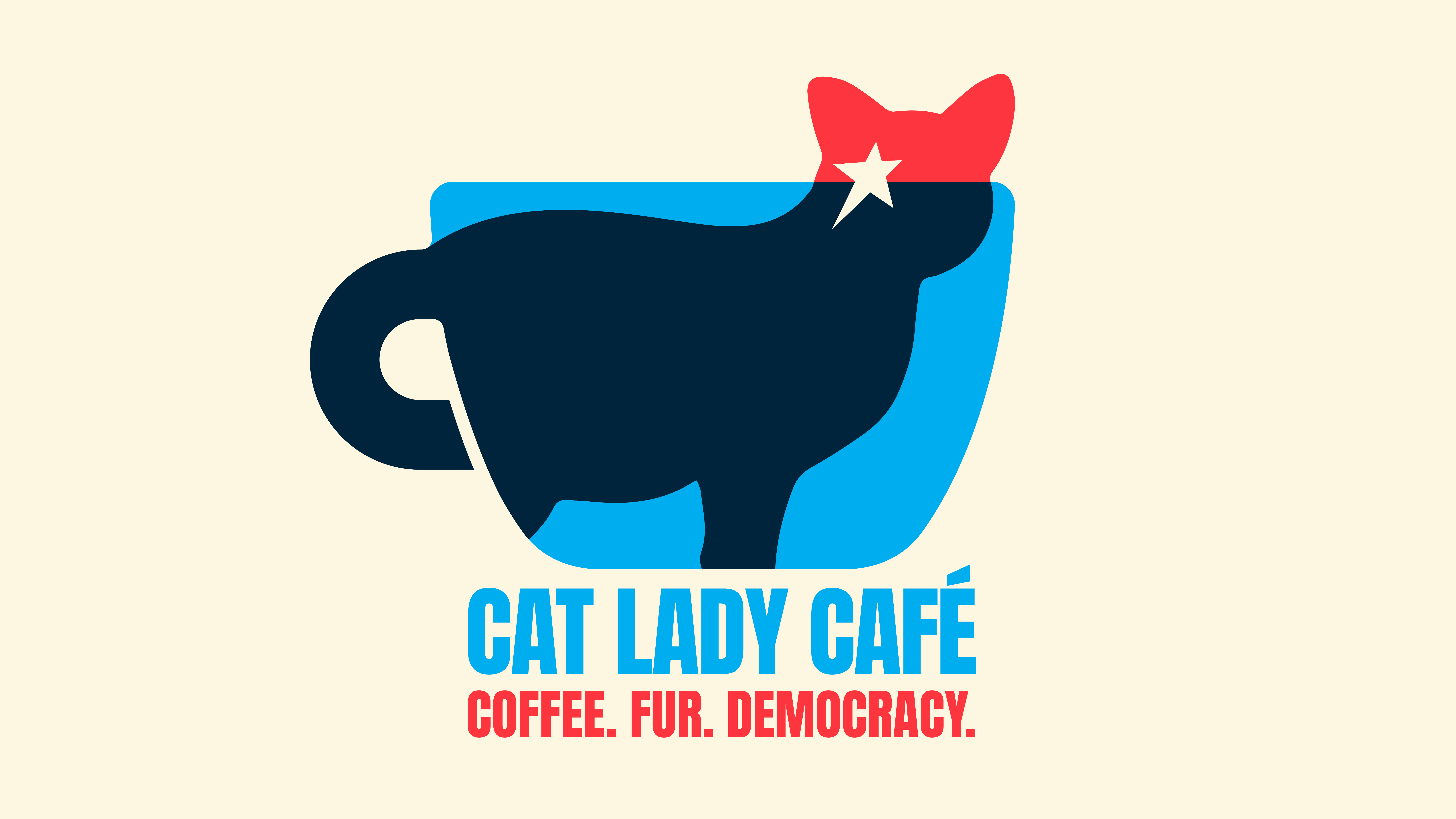
There were three key visual attributes that made the old Early Warning logo appear severe and anxiety-inducing: harsh corners, all-caps typography, and lots of red. I discovered I could change all three of these factors to help the logo feel less foreboding and more approachable—while still keeping it recognizable.
Color Palette
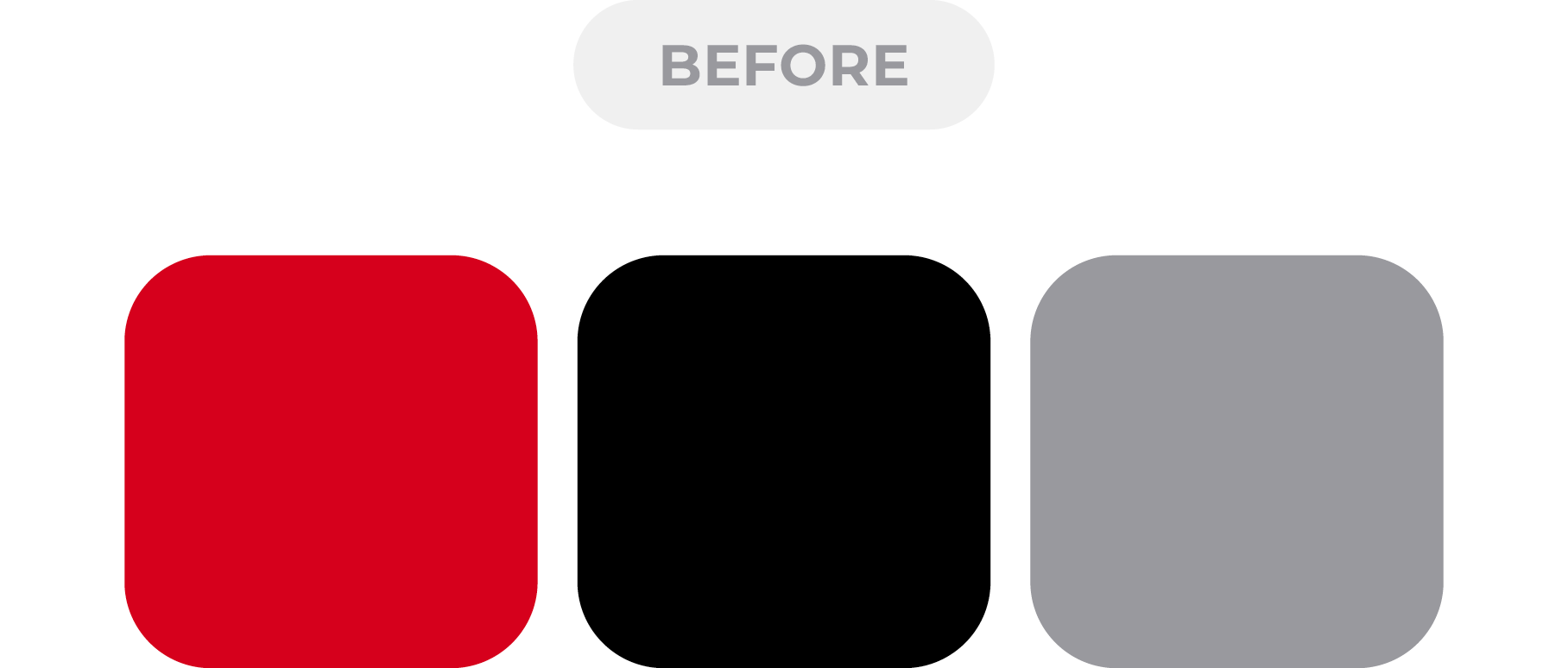
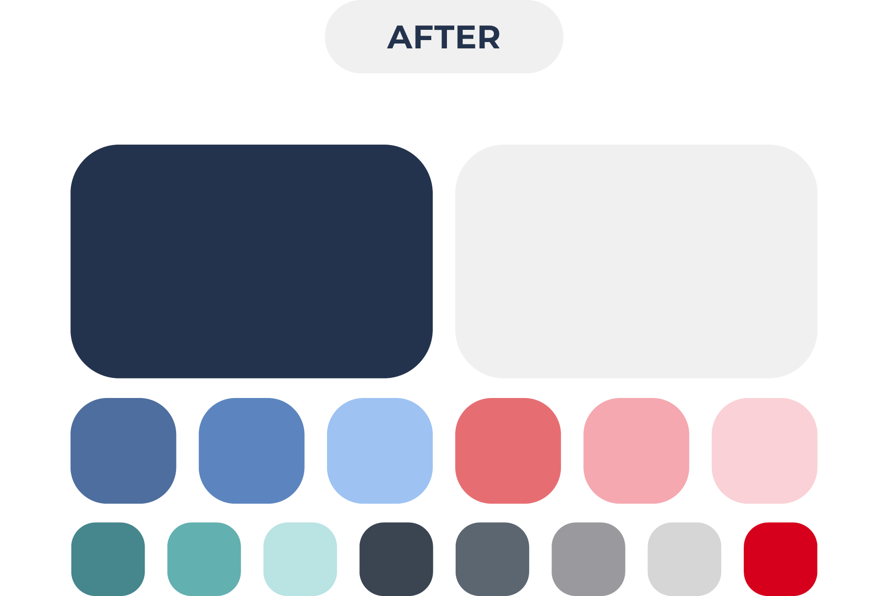
The old Early Warning brand had three colors: black, gray, and red. This palette focused on problems rather than solutions (red = danger) and evoked feelings of fear (you better use our products or your customers won't be safe!).
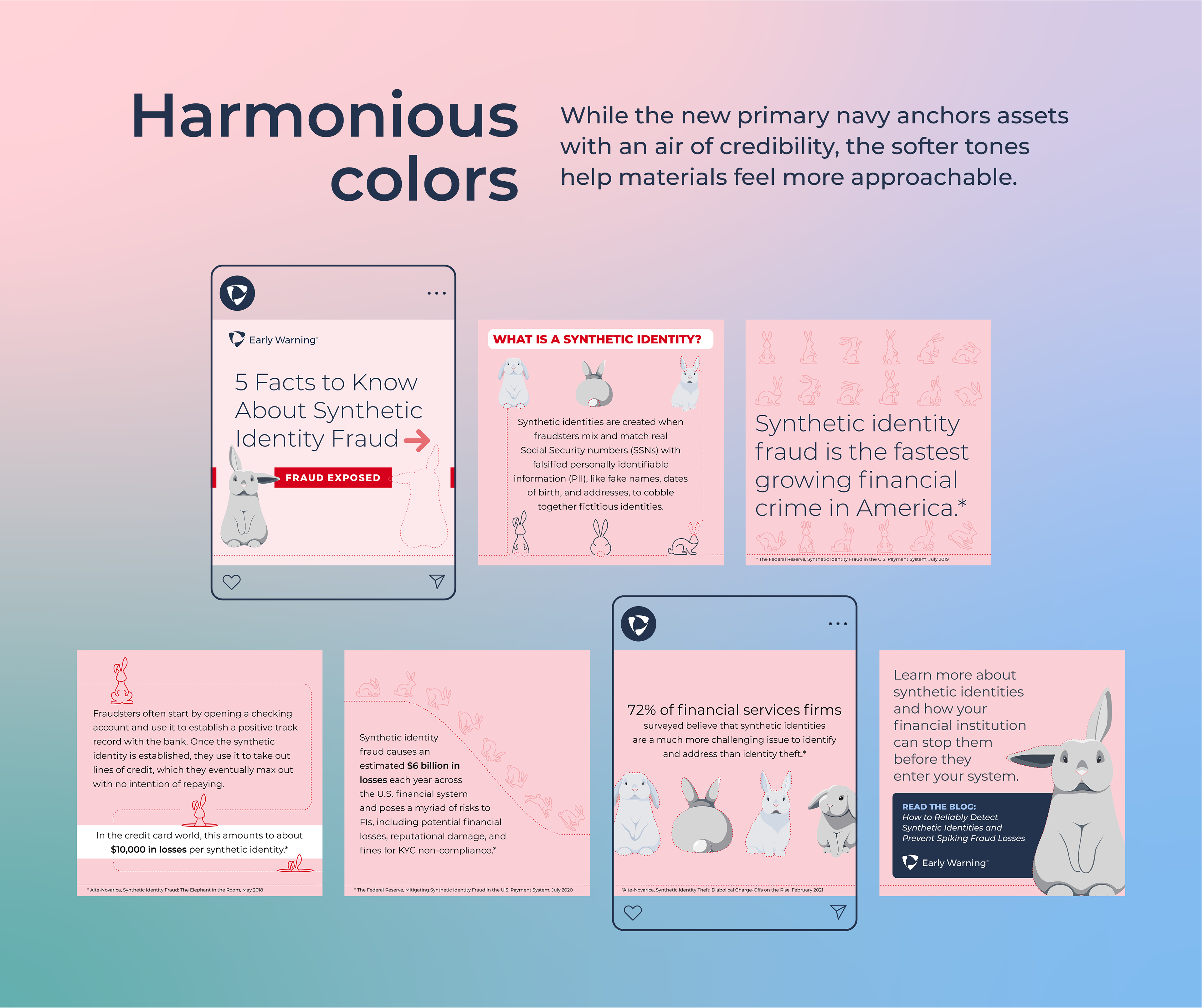
The new palette centers navy and soft blues, conveying security and peace of mind. The muted reds/pinks tie in with the original Early Warning red, while setting a calmer tone. The tertiary palette includes a spectrum of greens to symbolize continuous growth and innovation, keeping the original red as an accent.
Typography
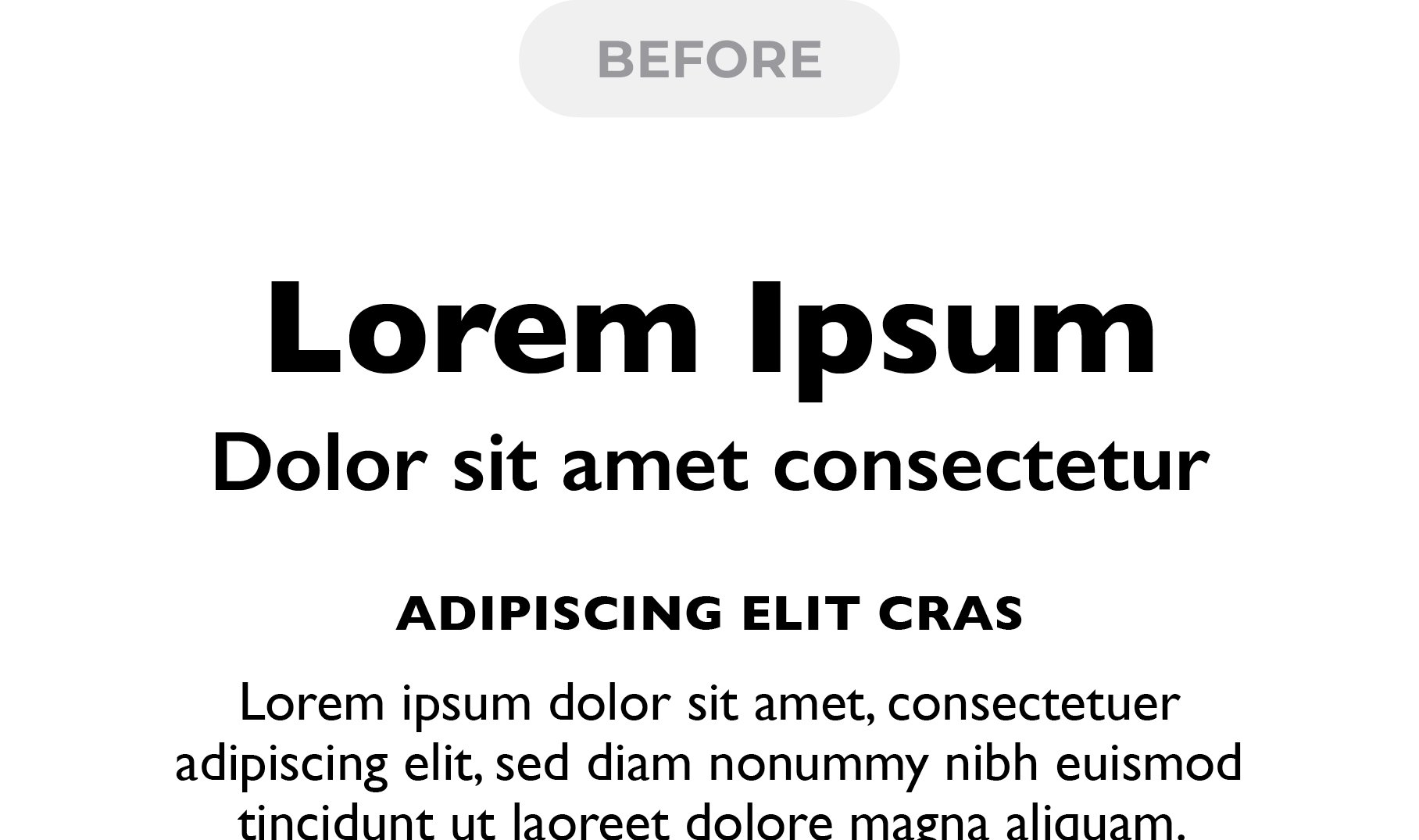
The condensed, heavy appearance of Gill Sans (the old brand typeface) offered limited styles to choose from, and resulted in materials that felt dated and overwhelming to read.
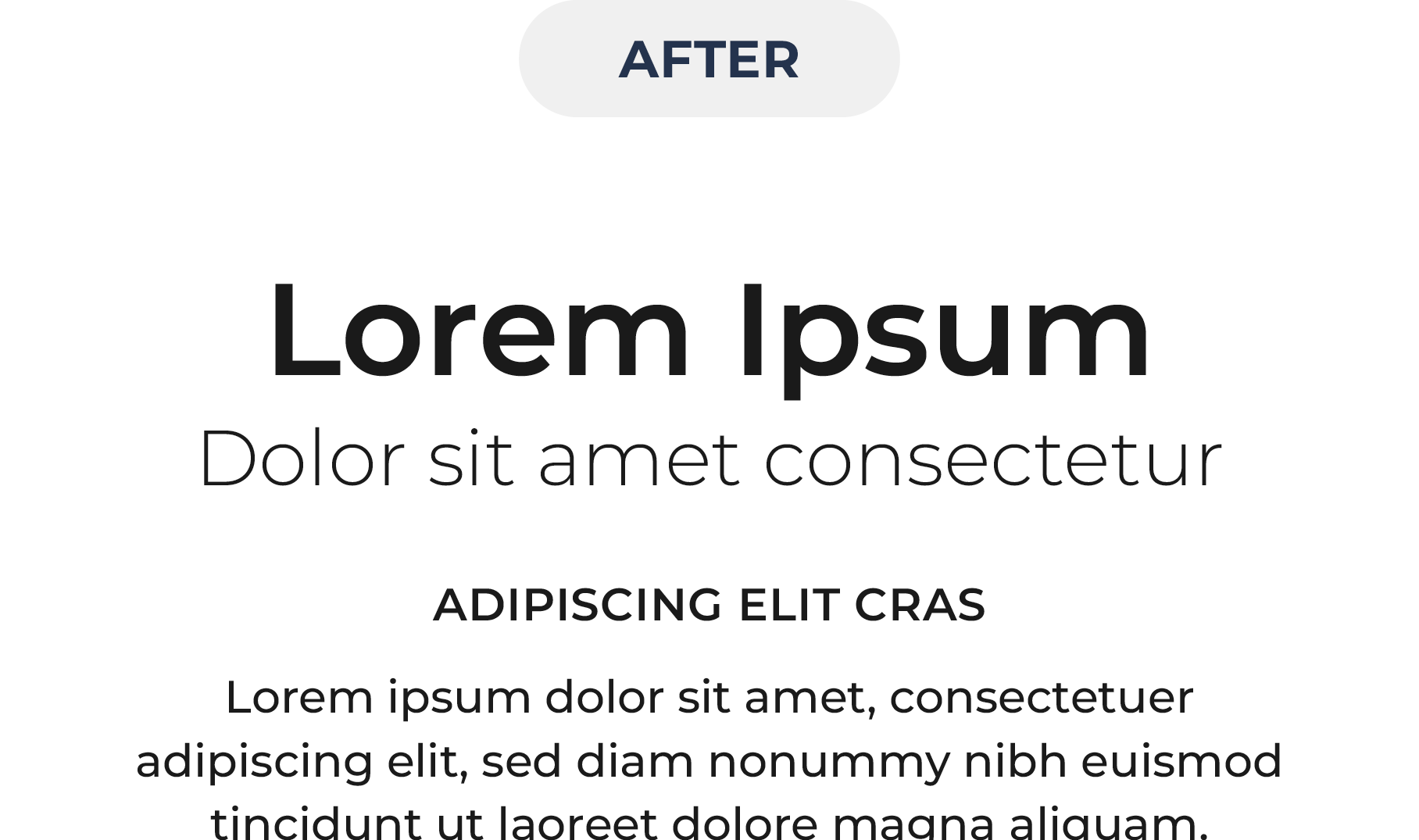
The new brand typeface, Montserrat, is an elegant, modern typeface. It is fresh and approachable while still conveying authority and experience. It offers a broad range of styles, enabling a versatile, refined type hierarchy.
Iconography
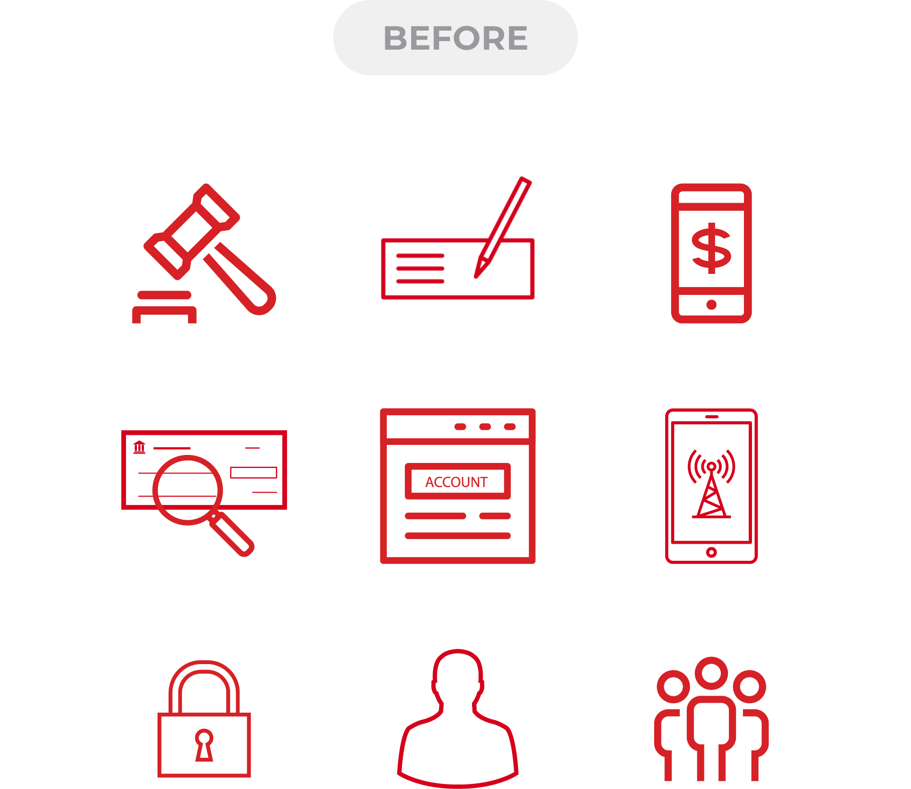
Before the brand refresh, Early Warning was using a mismatched set of icons from various stock websites. With no standardized aesthetic, our materials appeared inconsistent and cluttered.
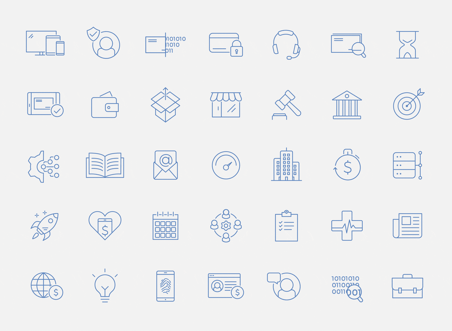
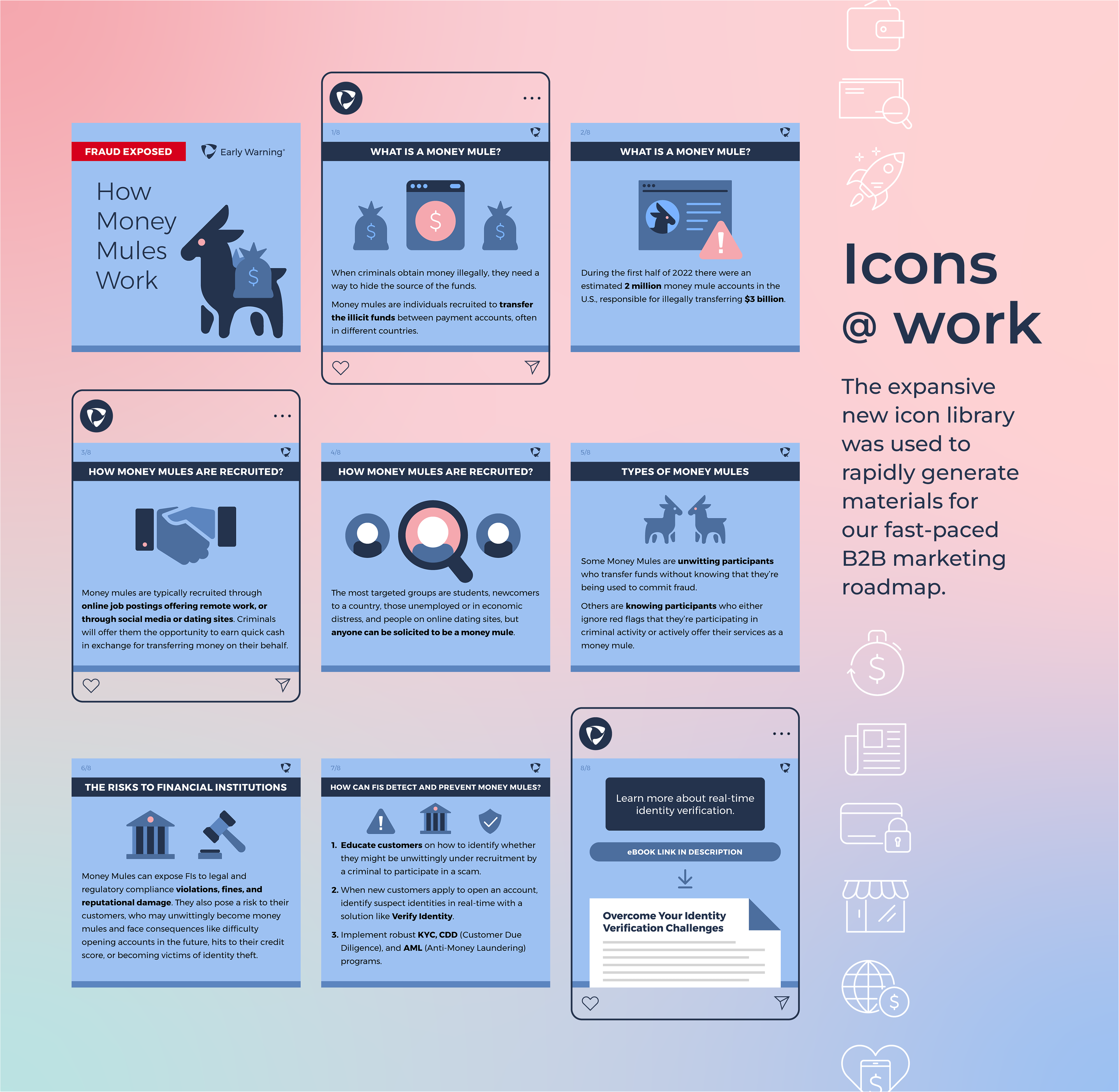
I developed a custom icon style, consisting of over 130 line icons with clear guidelines for color, line weight, level of detail, sizing, and padding.

Later, I developed a solid filled icon style to add more color and visual interest where needed. These icons also served as a starting point for more detailed illustrations. After hiring a team of designers, I worked with them to refine and expand the library to over 200 icons.
Photography
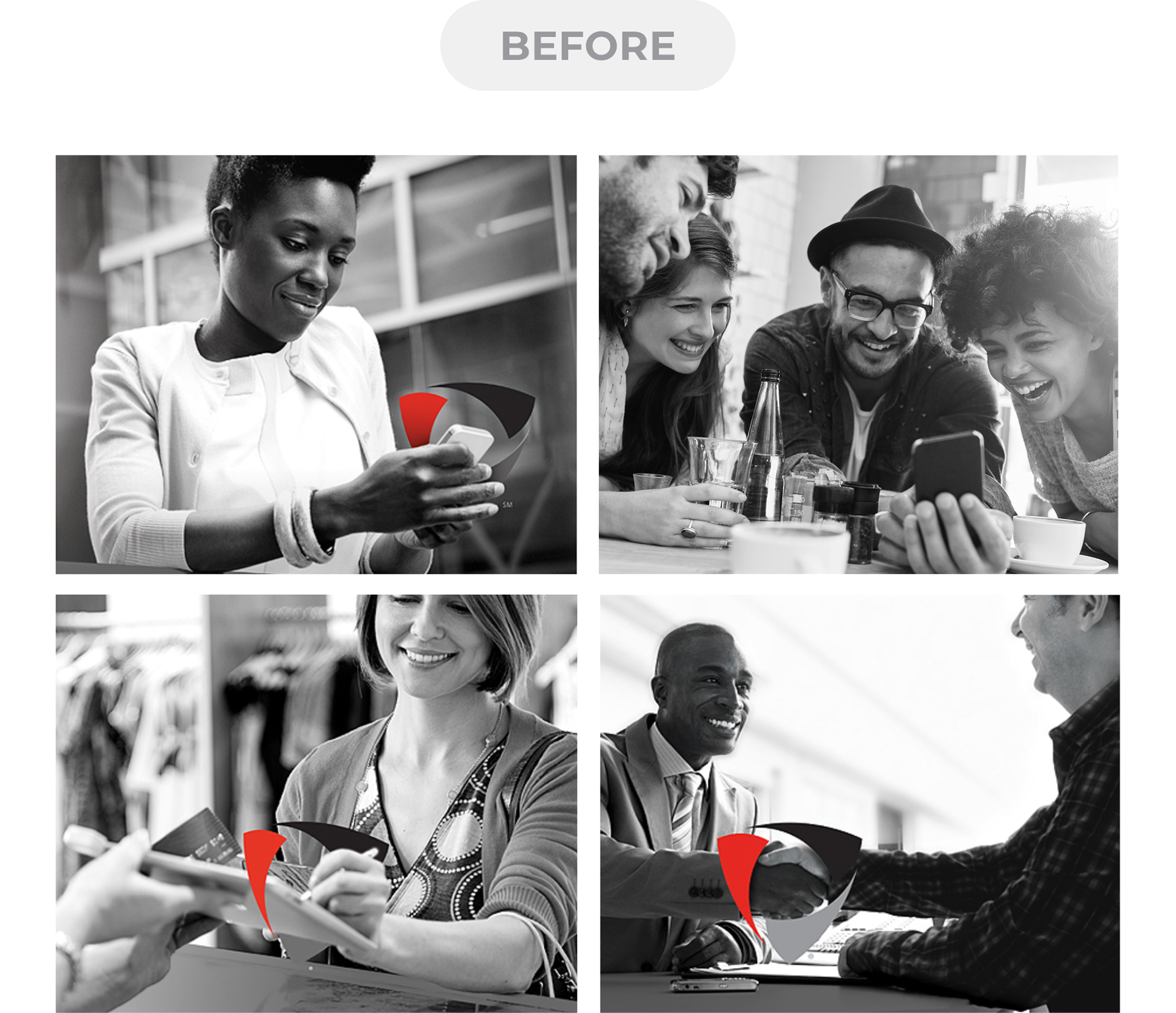
Early Warning was using grayscale stock imagery, typically incorporating a red highlight or the shield symbol from the logo. This style appeared dated, harsh, and ominous—when our goal was to come across as innovative, approachable, and trustworthy.
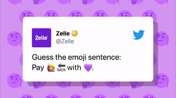
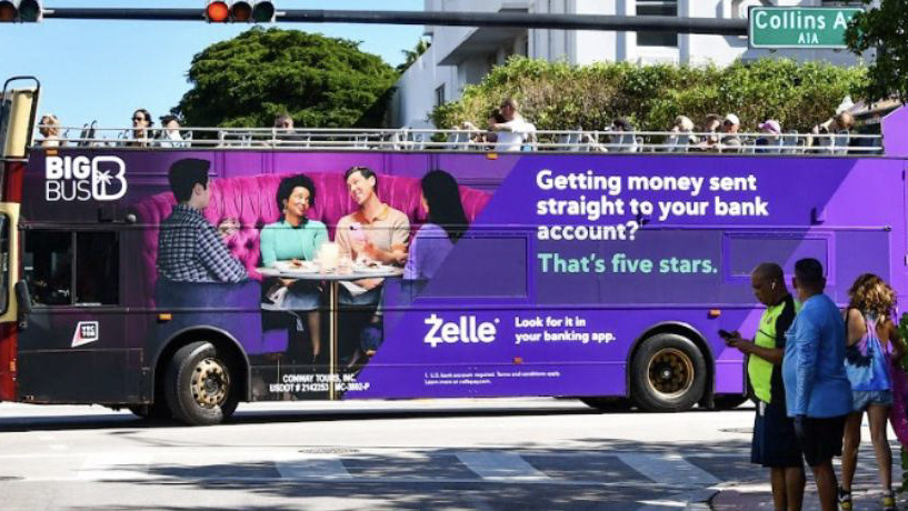
There was no budget for custom photography, so I created guidelines for sourcing and editing stock images—and compiled a library of over 50 images which I edited to achieve a cohesive aesthetic. Bright, saturated photography is now used to represent how Early Warning's products positively impact the lives of real people.

Some additional samples from the Early Warning stock photography library:


My role: Creative Director; Art Director; Design Lead; Brand Designer
Agency partner: Epipheo (video) | Other contributors: Jorge Carreño Gatica, Ryan Gallagher, Julie Grantz